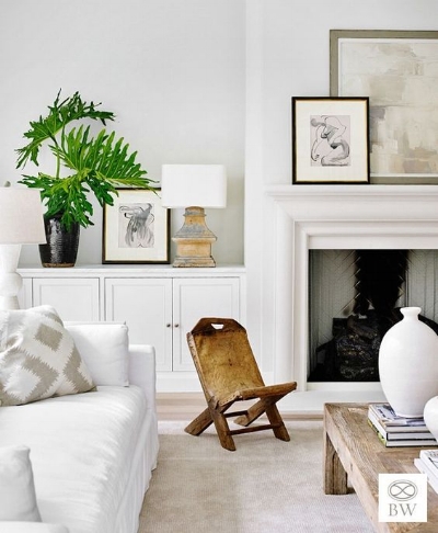
Want a home that flows seamlessly from one space to another? The key to achieving this look is creating a whole home color palette. The idea of selecting a color palette for one room, much less a whole home can seem overwhelming but after following my 5 steps, you’ll have a color palette that reflects you.
How do you want it to feel?
You can look at Pinterest all day trying to find that perfect look, but to start you need to think about how you want your space to feel, not look. Clean, relaxing, elegant, “lived-in”, sophisticated, spacious, warm/cozy, energetic, casual, etc.
To hone in on how you want it to feel, ask yourself questions like what do I want to do in my home, what do I want guests to feel when they are in my house and how do I want my home to serve me.
Use the color wheel.
Once you know how you want your home to feel, you’ll find yourself drawn to one of these color schemes.
source
If color scares you or you prefer a more clean and neutral feel, you’ll want a monochromatic scheme. Monochromatic is one color in various shades, tints and tones.
For those that prefer a harmonious and peaceful environment, you’ll want an analogous color scheme. This is the color scheme I use in my own house. Analogous schemes are colors that are next to each other on the color wheel like blue, green and yellow or purple, red and orange.
If you love high contrast or want an energetic, lively space, a complementary scheme will achieve this look. Complementary colors are opposite of each other on the color wheel like blue and orange or red and green.
What already exists?
The next step is to determine what colors already exist in your space like floor color, furniture upholstery and anything else you don’t plan to change. Figuring out the undertones of these will help determine which colors you pick in the next step. Undertone colors are red, green, blue, brown or yellow and they are either warm or cool.
Tip: One easy way to find this is by holding a piece of paper the color of the undertone up to the floor or furniture. It’s like the old black or navy trick. Hold something black up to a navy dress and it’s obviously navy. Same applies here. Put a red piece of paper on the floor and it will obviously be red or you’ll need to try another color.
Pick your colors.
A color palette should not have more than 5 colors. If you love color and you don’t think you can limit it to 5, wait for the next step. If you are overwhelmed by color, don’t worry, you can still achieve that neutral, clean look with 5 colors. Here are the 5 colors you need:
1. White: This will be the color of your doors, trim, ceiling and cabinetry (if you go with white). You’ll want this to have the same undertone as your existing pieces like your floors and countertops. There are hundreds of whites, so grab a couple colors and test them next to these fixed pieces.
2. Neutral: This will be your default go-to color. You’ll use it in connecting spaces like hallways, stairwells and open spaces. Again, this color will have the same undertone as your existing pieces and white.
My favorite go-to neutrals for warm undertones are Rockport Gray (BM), Agreeable Gray (SW), Repose Gray (SW) and Classic Gray (BM) and for cool undertones, I like Gray Owl (BM), Stonington Gray (BM), Passion (SW) and Reflection (SW). Benjamin Moore’s Classic Gray is what I used in my home.
3. Saturated Color: This is your bolder, base color for the color palette. Maybe it’s your favorite color like navy, green or red. Note: you do not have to paint any room in your house this color. Based on the color scheme you picked, this might be brought in through accessories like pillows. For analogous schemes, this is most likely the middle color.
4. Another Color: This is a friend of your saturated color and should be less bold. For monochromatic schemes, it would a lighter shade of your saturated color, a color next to your saturated color for analogous schemes and the color opposite on the color wheel for complementary schemes.
5. Accent Color: This is for fun pops of color and to add depth to your color palette. You might see this color in throw pillows, as a velvet side chair or a more subtle stack of books on the shelf. You’ll want this color to pair well with your bolder colors, so this could be the third color in the analogous scheme, a dark neutral like charcoal or a light pastel.
Add variation.
source
Color palettes are great starting points, but you don’t have to limit yourself to those five colors. It’s important to use the white, neutral and one of the other three colors in each room, but we add variation with other colors outside of the color palette.s outside of the color palette.
You’ll always have your 5 distinct colors, but add variation (light or darker) of colors 3-5. Just make sure they have the same undertones as the neutrals!


